
A colourful bathroom: yes or no? Contemporary bathroom design invites bold use of colour, introduced in various ways: from walls to floors, furniture and details such as decorations and accessories, used to add chromatic accents that can transform how the entire space is perceived.
In the art of interior design, the expressive power of colour is one of the most important stylistic elements, creating the right atmosphere and giving spaces that personal touch.
Whether you want your bathroom to be relaxing, energising or refined and elegant, the colour palette you choose can change everything. This mini-guide inspired by Arcom bathroom solutions will guide you on a journey through colour matching, offering practical tips to choose the right tones for your bathroom.
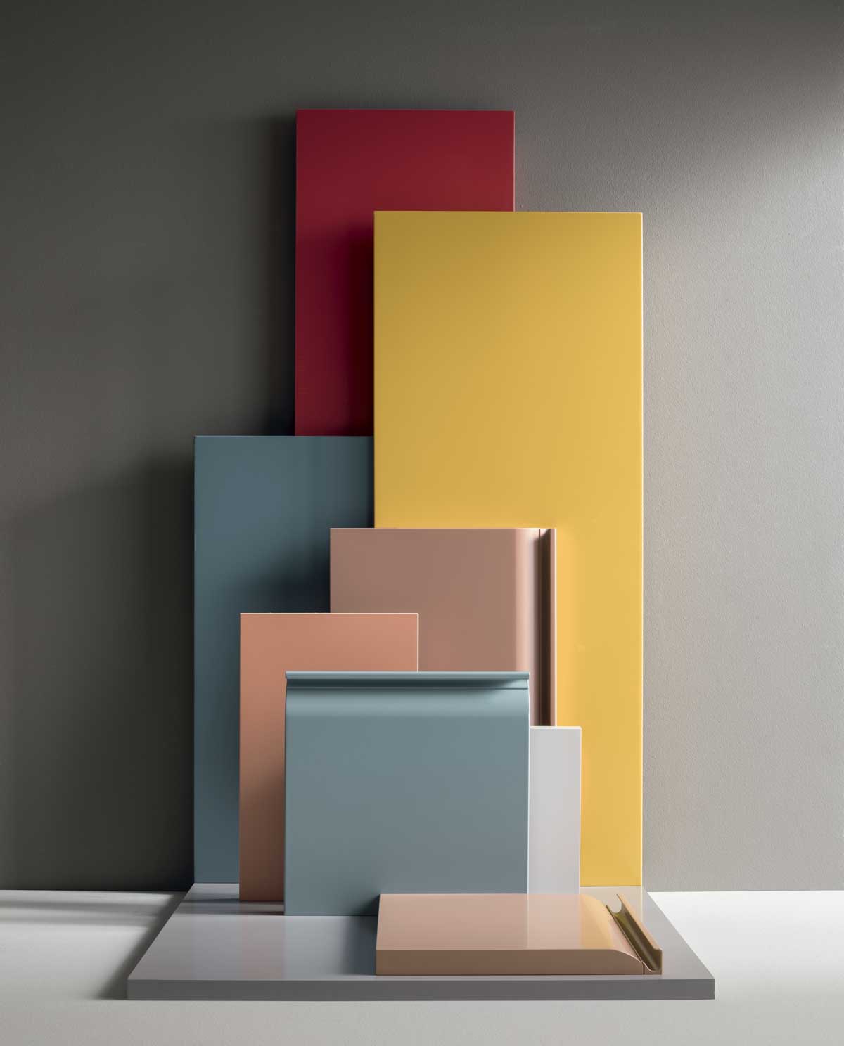
Choosing colours for your bathroom should begin with observation and careful consideration of certain factors, including:
Before thinking about personal tastes and trends, it is important to have a solid base on which to build a palette of colours that works. As you will have guessed, colour is far more than simply a question of pigment: it defines perception, sensation and identity. Let’s take a more detailed look at how to choose the perfect colour for your bathroom.
We should begin by drawing a basic distinction between warm tones and cool tones. Looking at the colour wheel, the difference between warm and cool tones is immediately evident. Warm colours are those running from red to yellow-green and feature a dominant red or yellow component.
Cool colours, on the other hand, range from green to purple-red, with a dominant blue component.
The colour wheel is basically made up of 12 colours, divided into primary (red, blue and yellow), secondary (obtained by mixing primary colours together) and tertiary (obtained by mixing primary and secondary colours). Studying the colour wheel helps us to better understand colours, their use and the logic of colour matching.
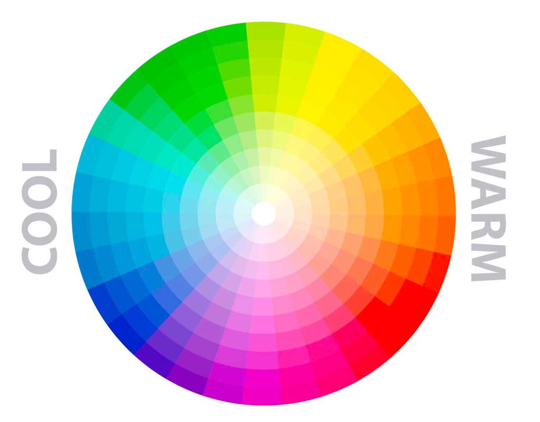
But colours don’t only have a visual impact, they also affect our emotions. Warm colours transmit energy and envelop a space, whilst cool colours tend to transmit a sense of calm, as well as creating a sense of space.
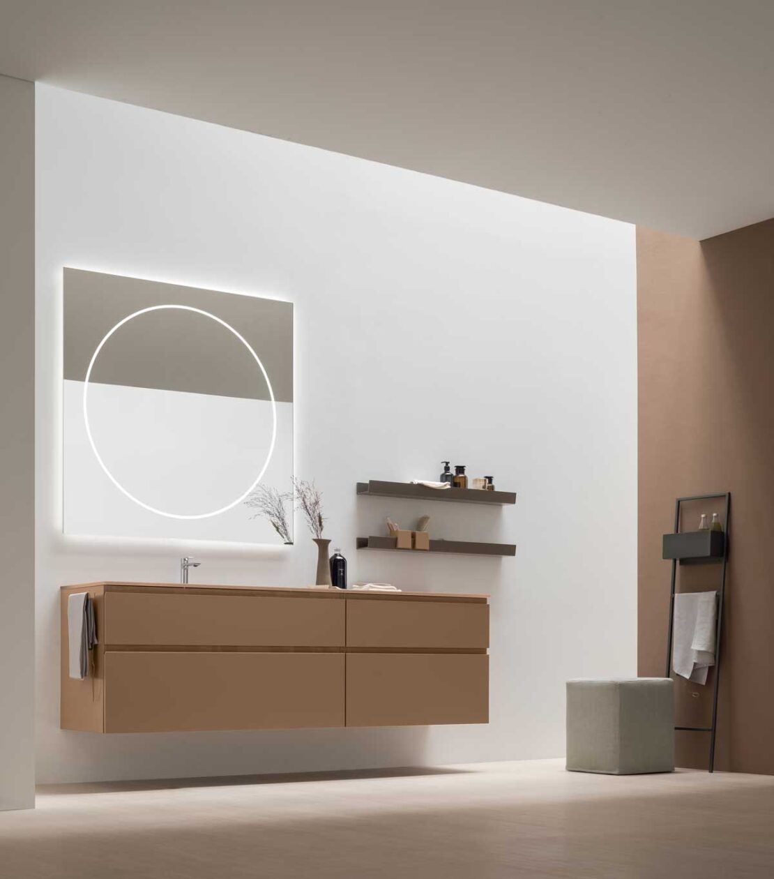
A practical example? Let’s take the following Arcom bathroom composition: the colour Cotto used for furnishings and accessories such as the stand and shelves infuses the space with warmth, perfect for an inviting atmosphere.
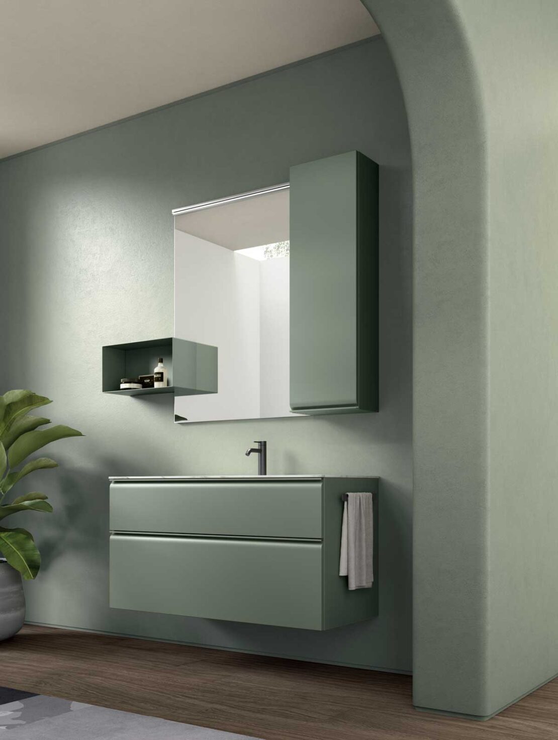
A blue or sage-green lacquer, on the other hand, introduces a sense of freshness and order to a space, also giving it a lighter feel. This means that these are ideal colours for decorating small bathrooms.
Finally, there are neutral colours, including all greys, browns, beiges, and black and white, which do not form part of the colour wheel. These are ideal as a base colour for any pairing. Providing the perfect background, they allow use of bold accents without weighing down the space: a blank canvas where you can really express your style.
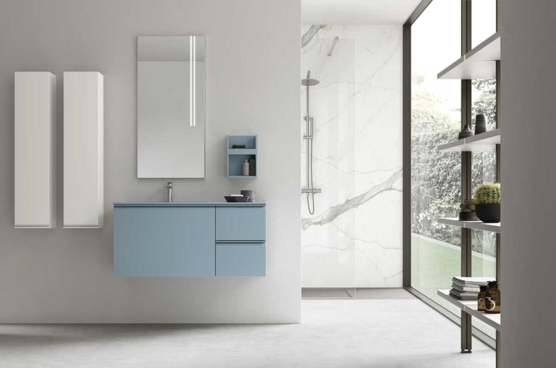
When choosing the colour for your bathroom, it is important to consider the colours of walls and flooring but also furniture, accessories and details such as textiles. For a colourful bathroom, you can choose between the following options:
A monochrome bathroom is dominated by a single colour. This is the perfect approach if you love one particular tone. But even if it seems like the most effective choice, it might not be the simplest, as there is a risk of the space feeling “flat”.
One way to avoid this is the combination of different materials in the same tone. Here, contrasts can be created with different finishes of a colour, such as matt/glossy, or polished/textured.
Even one contrasting material can break up a composition without compromising the single-tone concept.
In the following example, we present a material-effect coating for the cupboard doors under the washbasin finished in marble, a material that is extremely on-trend, with coloured veining that matches the green tones to maintain the selected colour mood.
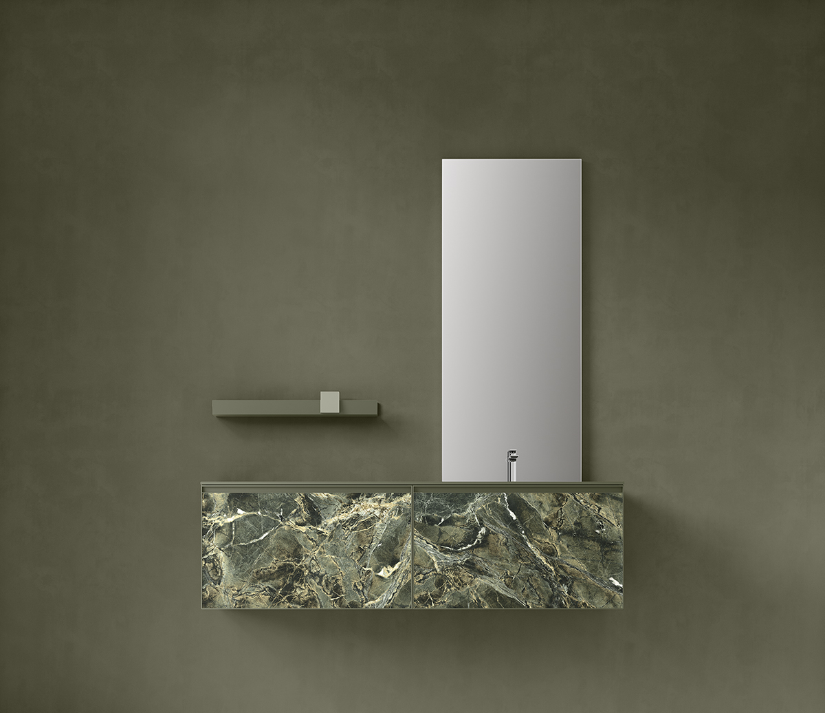
A tone-on-tone approach, on the other hand, begins with a specific colour and develops the design with lighter or darker shades within the same chromatic range.
Then there are contrasting pairings, ideal for those who love a bolder style. In this case, it is important to choose a “base” colour, ideally in a neutral tone such as white or butter (the latter is highly on-trend, crossing over from the world of fashion), beige or sand, or even a light grey or textured finish such as cement, to make strong, bright colours pop.
Contrasts work best for furnishings, creating surprising effects even in a space like the bathroom, but it is important not to go over the top. A colour that is too bold, like a vivid red or bright green, can soon become too much in a bathroom. This is why, in terms of contrast, the “desaturated” versions of the same colours are a popular choice, in slightly more powdery shades, which retain the colour’s character without feeling excessive.
Colours are altered by light and space. A colour seen on a card sample will not have the same effect when it is spread across an entire wall, floor or piece of furniture with a particular finish. This means it is important to consider colours in the actual space, under natural and artificial light, and at different times throughout the day.
An example: take the colour pearl grey, which can seem slightly bluish in the early morning and closer to beige at dusk. This shows just how much light can alter our perception.
The size of the room also plays a fundamental role. In small bathrooms with limited light, it is better to opt for lighter tones that reflect the light, opening up the space and letting it breathe. Larger and sunnier rooms, on the other hand, lend themselves to deeper, more intense tones, capable of enveloping the space without becoming too heavy. Finally, the aspect of the room is also very important.
When choosing multiple colours for bathroom interiors, you risk getting the proportions wrong: too much of a particular tone can feel overbearing, while too little may fail to achieve the desired style. There is a simple and very effective rule to follow as a guide, often used by interior designers: the 60-30-10 rule.
How does it work?
In practice, even a bathroom based around neutral colours can be conceived with its own original style.
Let’s take an example: in a bathroom with dove-grey, beige or sand tones, which are naturally more subtle and subdued, adding 30% of sage green and 10% matt black or gold metal for details will bring the overall design to life.
This is a simple and effective way to create balanced interiors that never disappoint.
Having explored how to choose colours, let’s move onto more practical aspects: how to combine them. Often, it is not enough to simply choose a tone that you like. The real challenge is understanding how to use multiple colours in the same room and avoid things becoming either over the top or too plain.
To help you find the right inspiration, Arcom has created five palettes for a colourful contemporary bathroom. Inspired by current interior-design trends and the fundamental rules of colour matching, from tone-on-tone effects to contrasts, these solutions are designed to provide tangible options.
We will begin with a monochrome palette that is anything but monotonous, with pink as the absolute star of the show. This timeless colour is always on trend, from fashion to interiors.
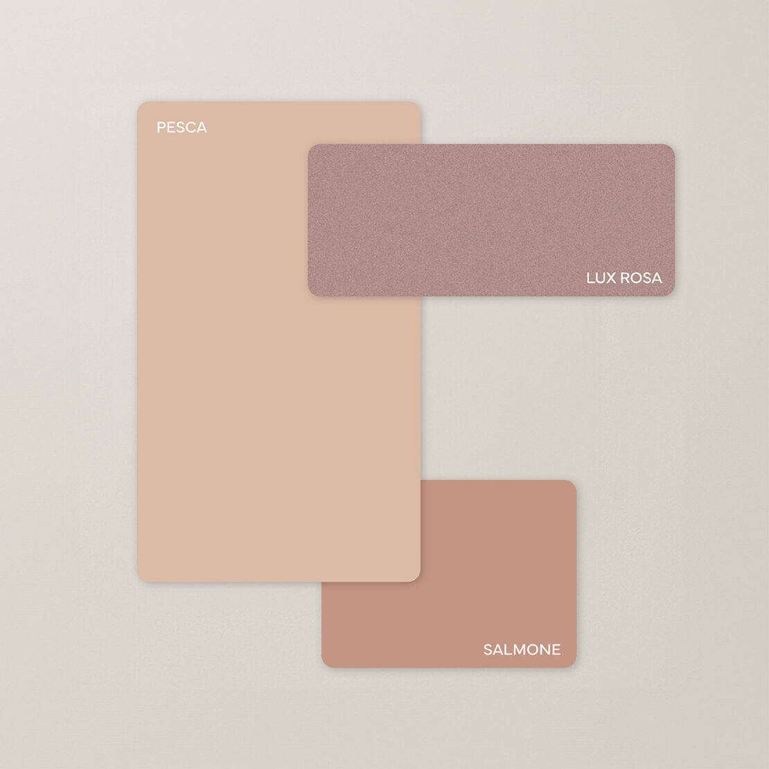
Shades range from more delicate peach to salmon, playing with different variants that remain perfectly chromatically aligned.
Forever associated with a romantic and embracing atmosphere, in this solution, pink takes on a surprisingly modern and glamorous feel in combination with metallic details, perhaps with slightly glittery finishes such as that of our Lux Rosa.
This effect also works well with tone-on-tone accents, both as a contrast and with finishes in warmer tones such as bronze or gold.
From glamour pink to earthy tones, for a bathroom with a warm and welcoming mood, drawing inspiration from nature.
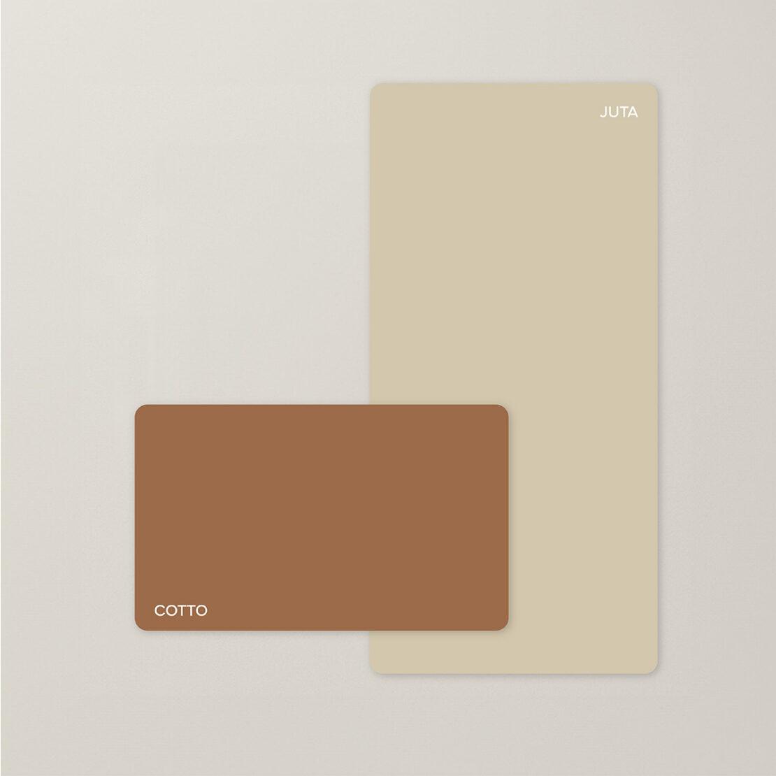
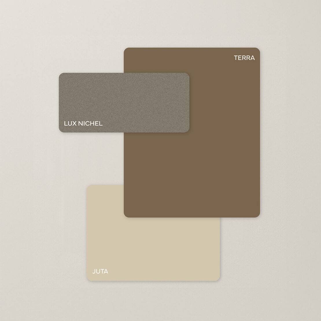
Below are two different palettes for a bathroom with earthy contrasts, softened here with neutral tones and metallic touches that break-up and balance the chromatic result. These are also perfect colours to pair with soft browns, such as PANTONE 17-1230 Mocha Mousse the 2025 colour of the year, warm and velvety, and capable of instilling comfort and balance.
To create a sophisticated and elegant bathroom, the perfect Arcom match is: Ottanio + Lux Oro with metallic finish.
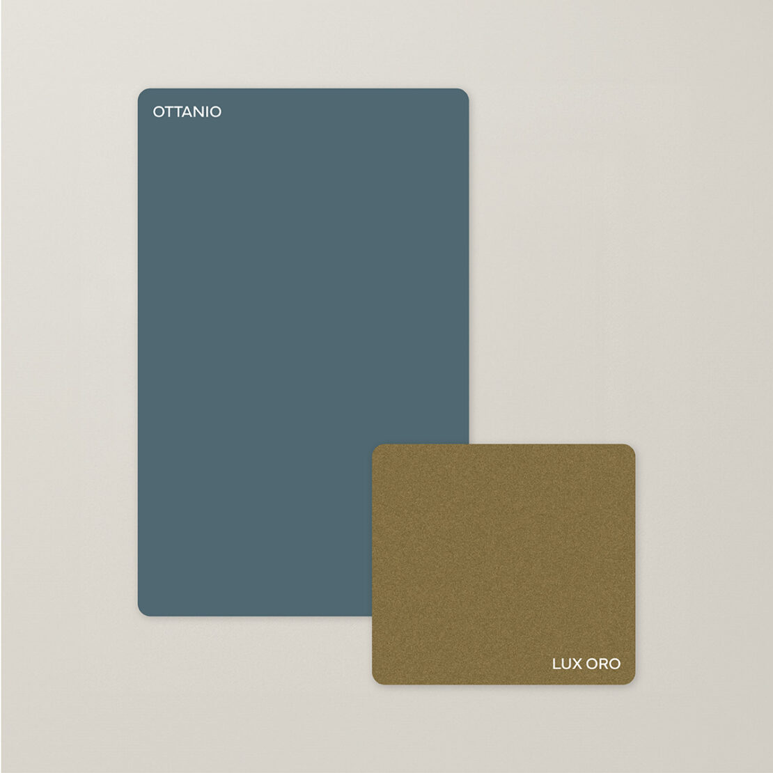
This is a very strong yet balanced contrast. On the one hand, there is the solidity and depth of Ottanio (a hybrid colour that blends shades of blue and green), and on the other the vibrant brightness of gold.
In recent years, together with Petrolio, the associated tone Ottanio has become a staple in colour palettes used by interior designers. This colour is widely loved and pairs well with precious metals (brass, gold and bronze) as suggested in our palette, but also with natural materials such as wood, marble and stone.
How to use them in bathroom interiors? You can opt for furniture in Ottanio with brushed-finish taps and profiles in metallic gold. To create a softer atmosphere, you can limit the use of Ottanio to a single wall of the room or to small details and let gold shine in all its splendour in the form of a piece of lacquered furniture or accessories.
A palette of “cool” tones spanning greens and blues. These colours are not diametrically opposite (like blue and orange, which create a high-impact contrast) but provide contrast through levels of saturation or temperature.
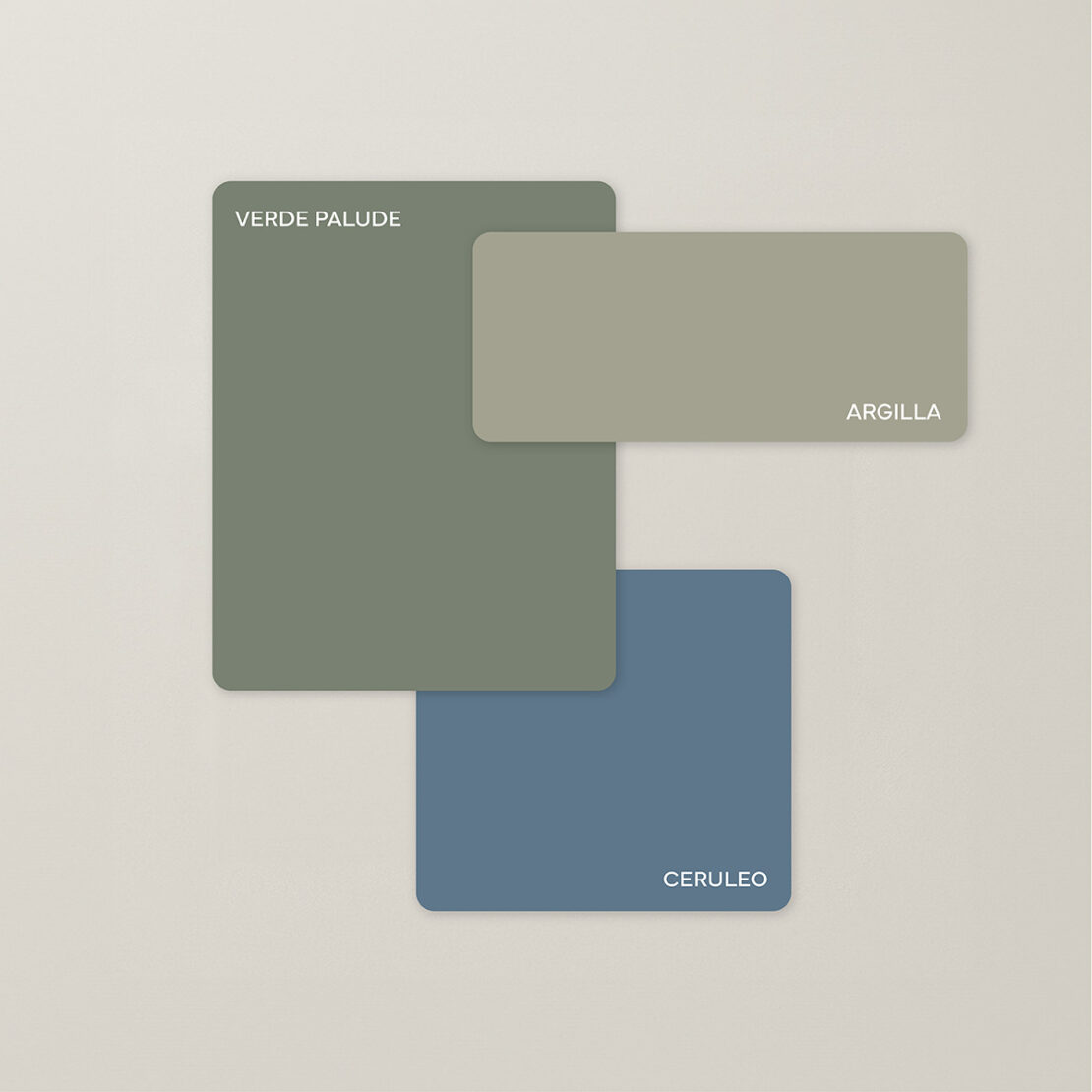
This palette shows how contrast does not need to be an explosion of opposites. The true art of interior design lies in establishing a visual harmony that is simultaneously dynamic and relaxing.
Another refined way to play with colour contrasts in the bathroom is to utilise matt and glossy finishes in the same tone. Matt finishes absorb light, while glossy finishes reflect it. Together the two effects generate movement and depth.
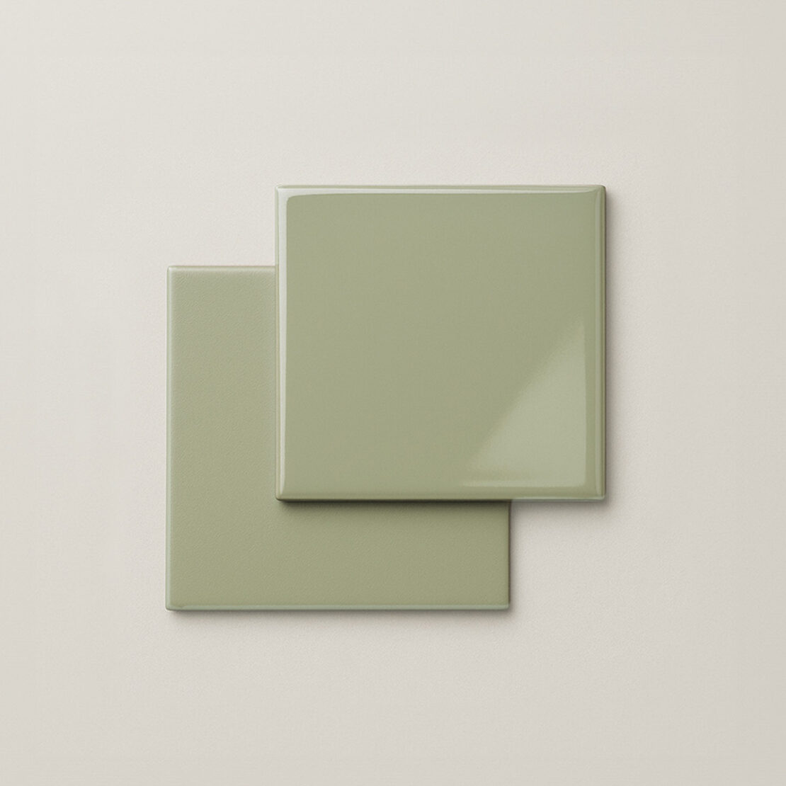
The contrast below in Pistacchio green uses the same colour in two finishes to provide different nuances and dynamics. This effect can be used on bathroom furniture, coatings and cladding, and flooring, particularly with decorative options, such as tiling.
Just like other rooms in the home, in the bathroom, a colour should never be chosen for a single element, but for the interior concept as a whole.
Walls, flooring, coatings and cladding, and furniture should work together for a single chromatic idea. A harmonious design can only be achieved through the interaction of different colours.
Some people prefer to maintain chromatic continuity across the different rooms of the home to create an overall theme, particularly if there is a specific, dominant interior style. Others decide to make the bathroom a little world of its own, coming alive with its very own palette. In both cases, it is recommended to start by making a mood board featuring materials and colour samples. This is a practical way to visualise combinations before their use.
In each room, the walls provide the main background. Light and neutral tones will increase the sense of space and light, while darker and deeper colours will create more intimate and sophisticated atmospheres, suitable for large and well-lit bathrooms.
Pastel colours (e.g. sage green, powder pink and powdery blues) add freshness and lighten a space.
The flooring, on the other hand, provides the chromatic base on which bathroom furniture generally stands. It is recommended to coordinate the colour of flooring with walls and furniture, evaluating whether to focus on chromatic uniformity, for a harmonious and minimalist feel, or contrasts, highlighting individual elements. Light and neutral flooring is a safe choice, while a darker floor can be given a lighter feel if paired with light-coloured walls or coatings and cladding that catch the light. In addition to the colour, the material chosen for flooring also helps to establish a particular style. Stoneware is the most versatile choice, with effects ranging from cement to marble. Resin provides continuity and a contemporary mood, while treated wood or wood-effect stoneware introduces warmth and a natural quality.
For a better overview, let’s look at some tangible examples: a bathroom with grey tones or cement effects can be brightened up with coloured furniture that punctuates the uniformity, or wooden details can be used to introduce warmth.
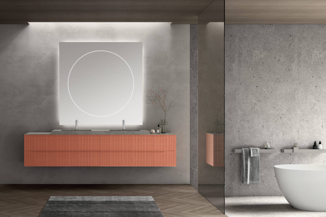

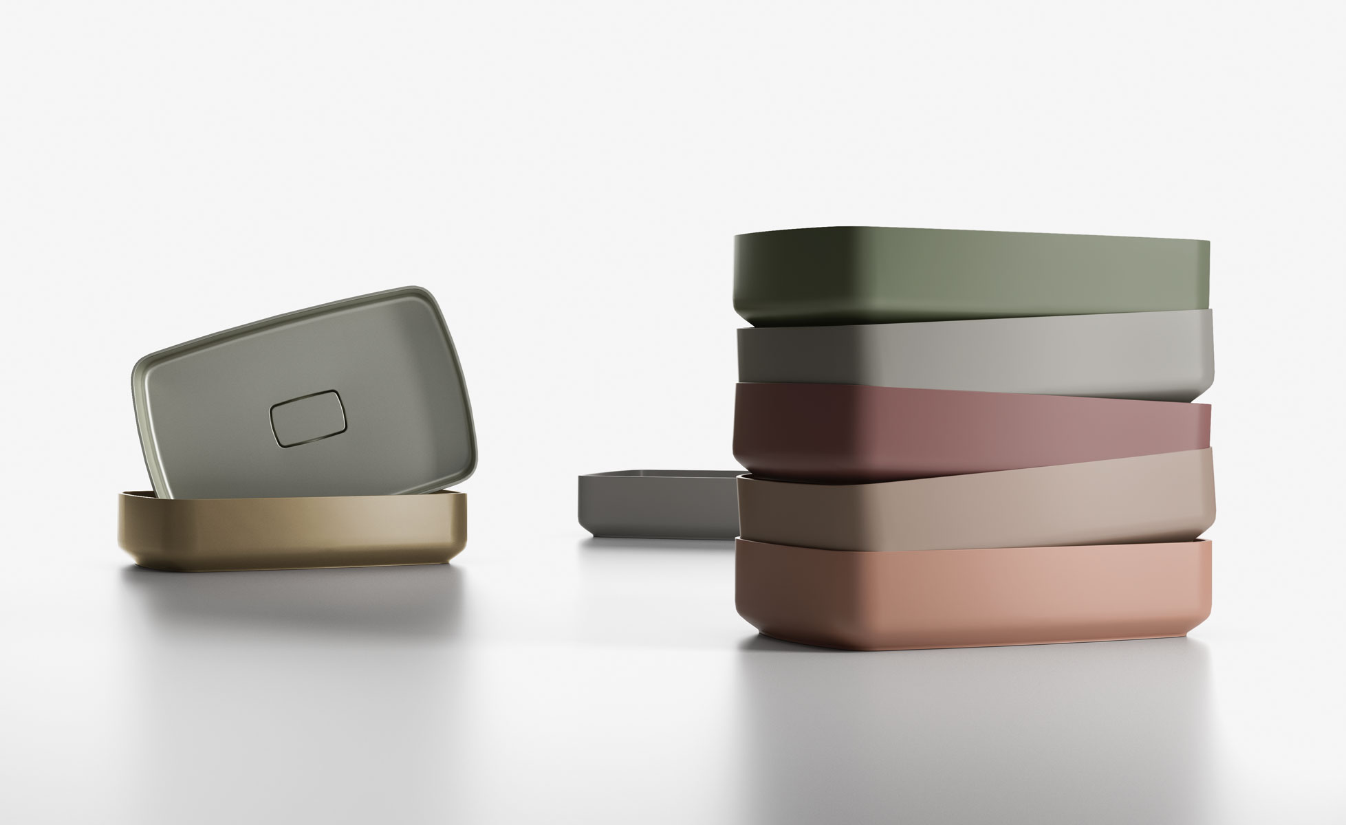
In addition to the main furnishings, details can also make a big difference: accessories such as mirrors, shelves, clothes stands or even the sanitary fittings can be part of the colour palette. Consider, for example, a bathroom with a coloured sink in one of the key tones of the bathroom colours.
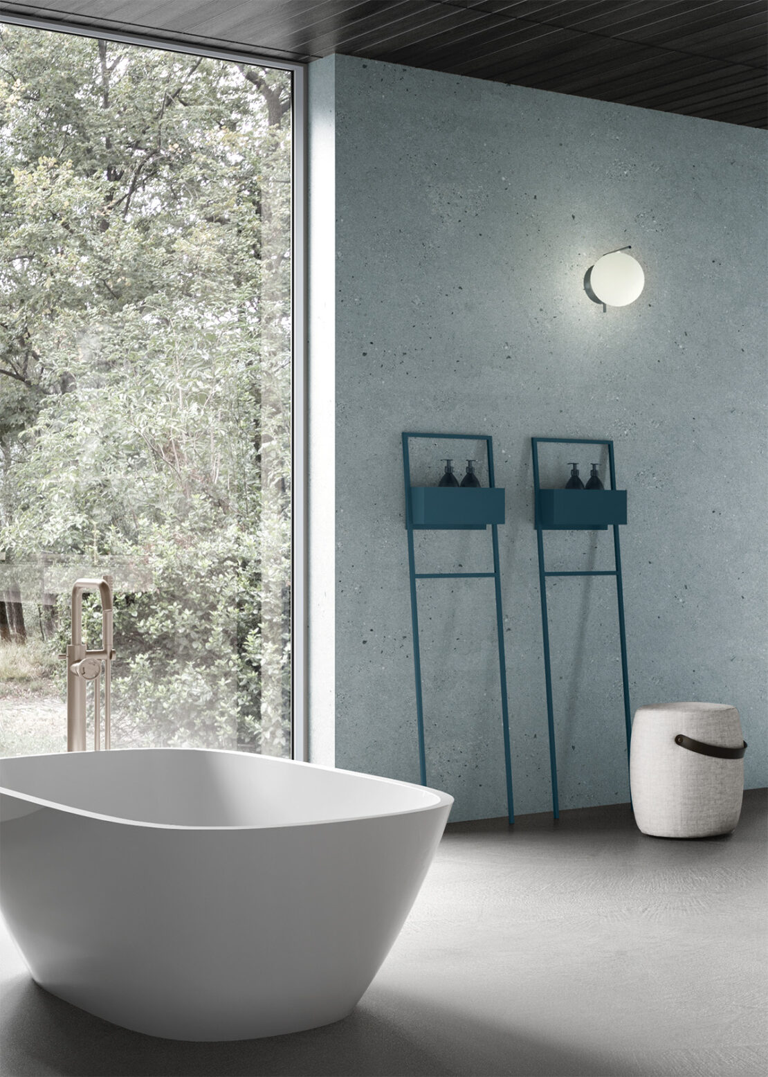
Or how about an accessory such as this free-standing towel rail in the same tones used on the wall? Perfect in relaxing blues, they become little colour accents with a practical purpose.

Another question: matt or glossy colours? In small bathrooms, glossy lacquer finishes are a valuable tool because they reflect light and open up the space. On top of this, glossy lacquer finishes are also a very suitable choice for a modern bathroom with a bright look. Matt lacquer finishes, on the other hand, transmit a soft-touch elegance and a more textured and welcoming feel: ideal if you are seeking to create a warm and sophisticated environment.
Another suggestion for overall coordination is to reuse the colours of applied decorative elements present for bathroom furniture, e.g. wallpaper, tiles with a specific pattern or wood panelling.

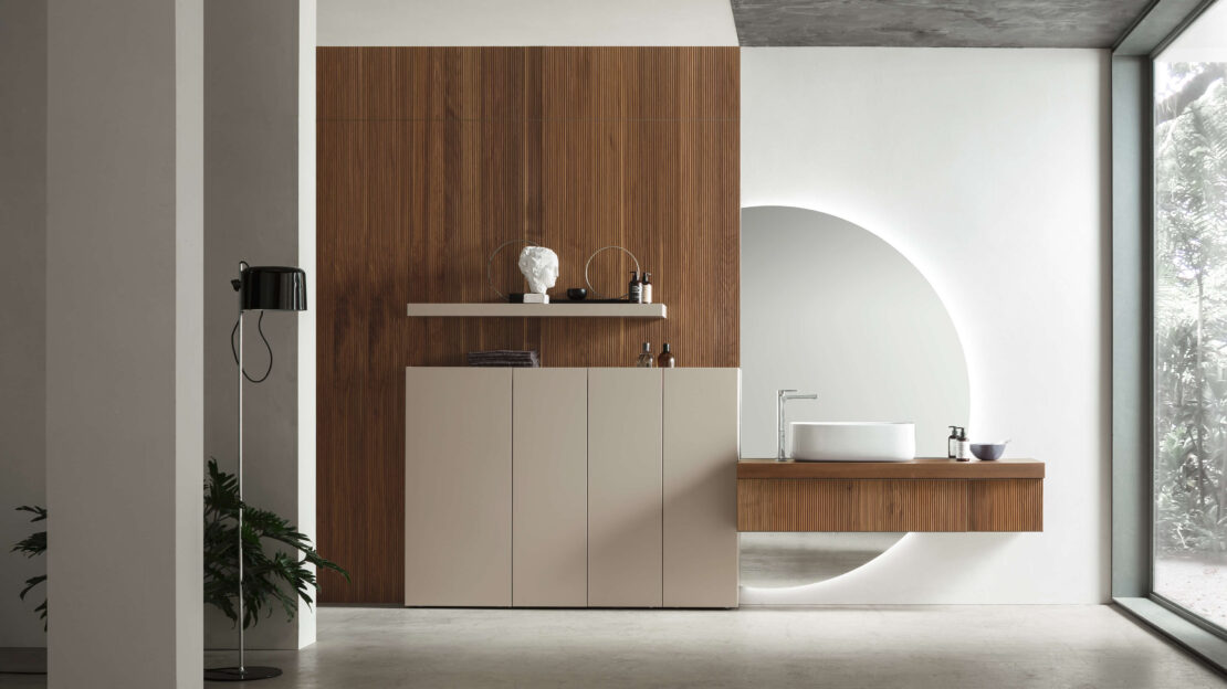
Finally, the choice between contrast and uniformity depends on what kind of effect you aim to create. Chromatic uniformity, with surfaces and furnishings using the same tone, transmits minimalism and elegance. Contrasts, on the other hand, which can be achieved in many different ways, enhance details of the bathroom design and add personality.
To sum up, when considering bathroom colours, there is no universal rule, but there are a set of solid guidelines to follow for the various cases.
First and foremost, the choice of colour must capture the character of the person living there, stating their style and personality. We have seen how to begin with practical elements, such as light, dimensions and materials, and how to play around with colour matching, contrasts and finishes to create harmonious and functional spaces.
Arcom collections provide a world of possibilities to design and personalise your own colourful bathroom: from glossy and matt lacquers to textured material-effect finishes, and from timeless neutral tones through to bolder and more contemporary colours, without forgetting our solutions with graphic decoration to add even more personality to your interiors.
Beyond bathroom furniture, Arcom also caters for colour-coordinated shower spaces with matching accessories for colourful little accents that transform a space into a modern bathroom.
As we await announcement of the new colour of the year for 2026, why not browse our website and let yourself be inspired by our colourful bathroom solutions.
Subscribe to our newsletter
Subscribe to our newsletter to receive the latest news and updates